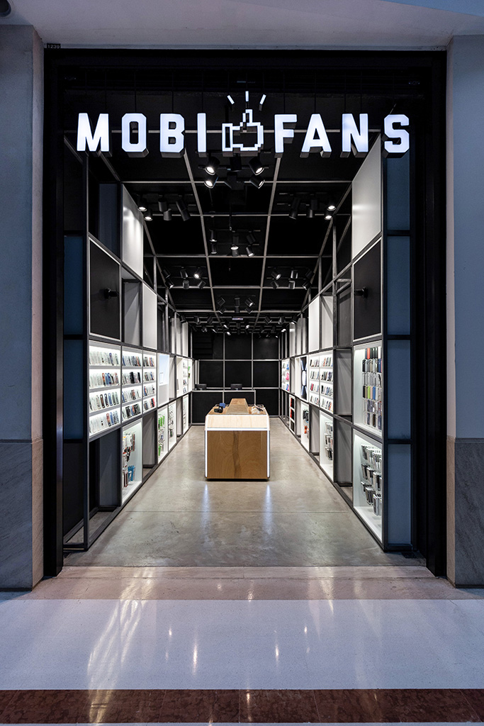
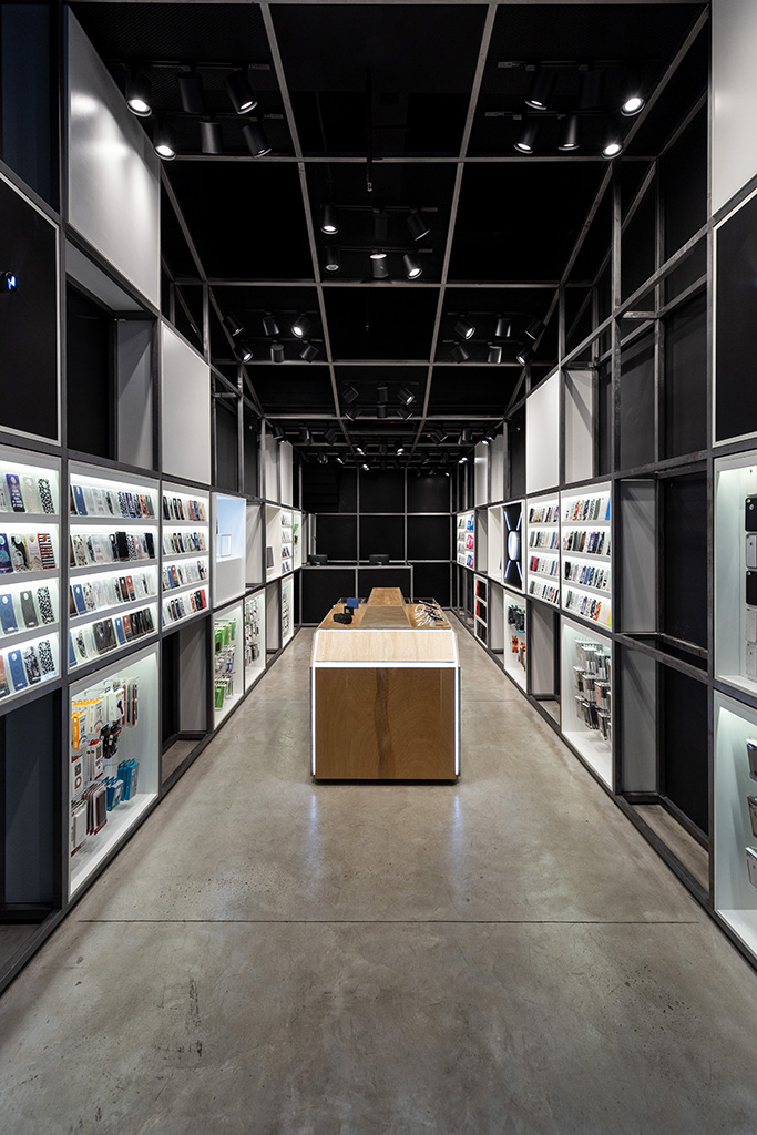
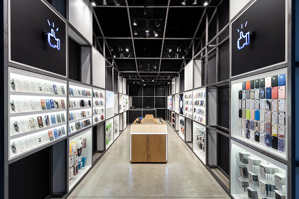
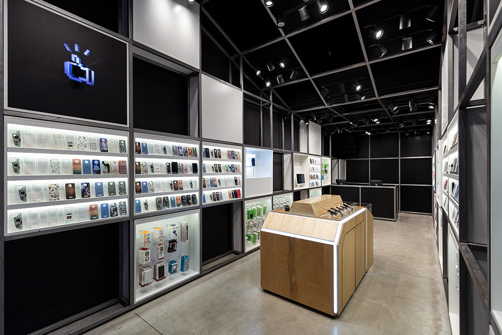
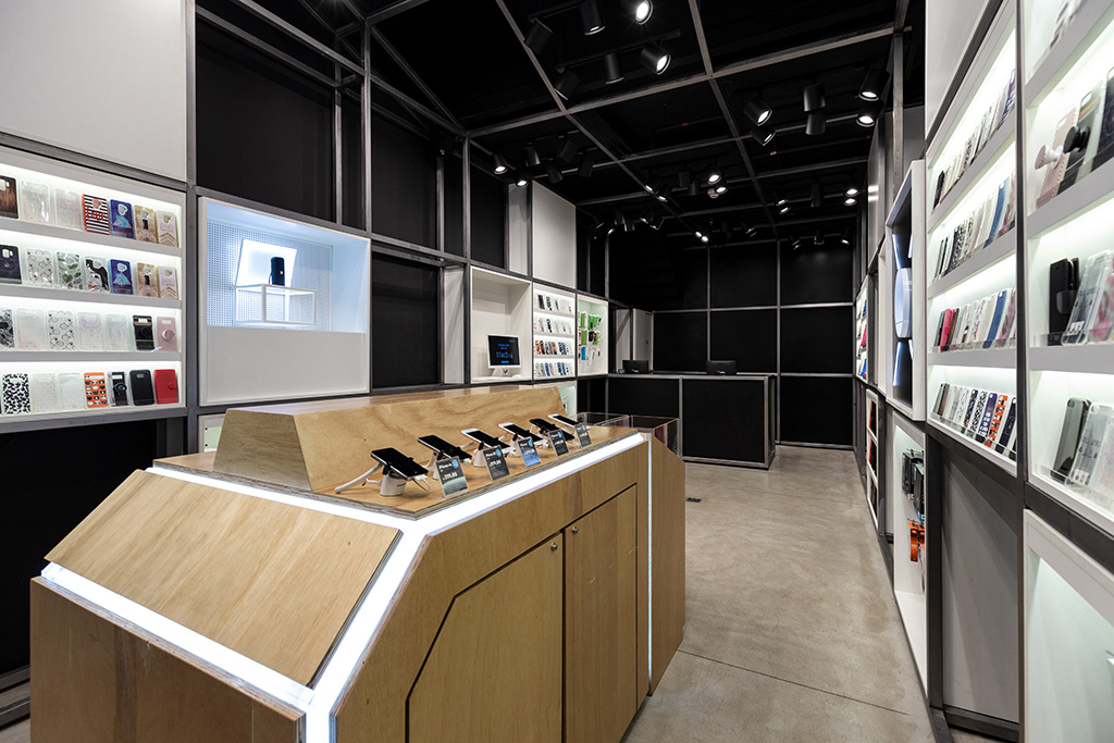
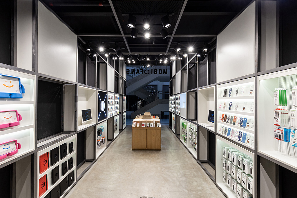
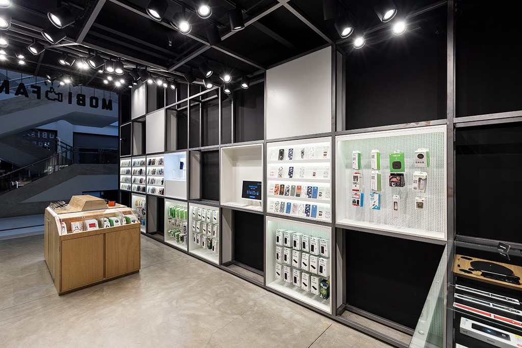
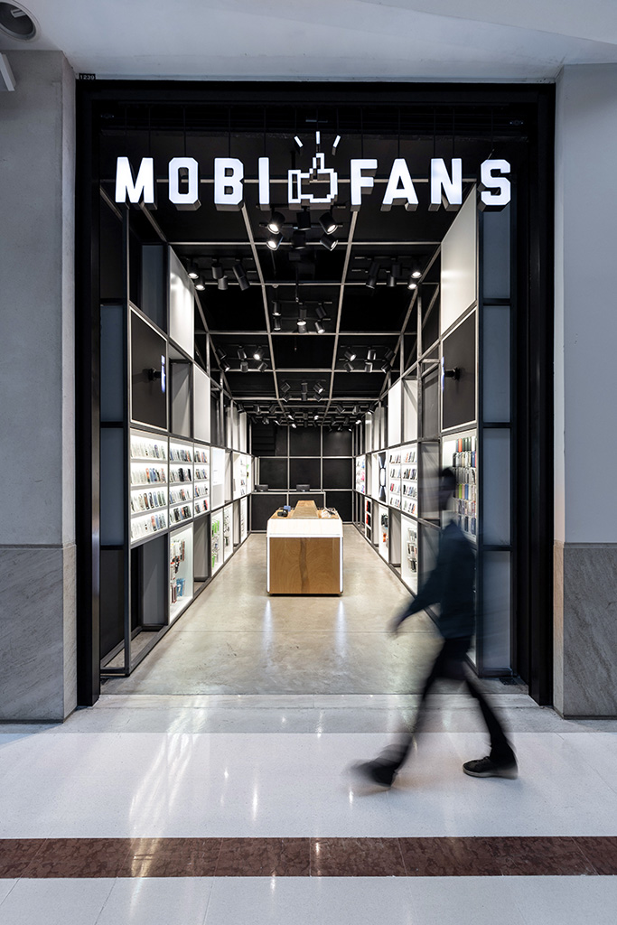
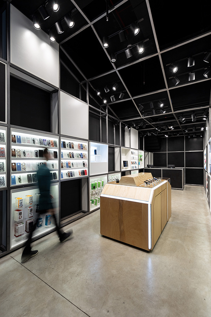
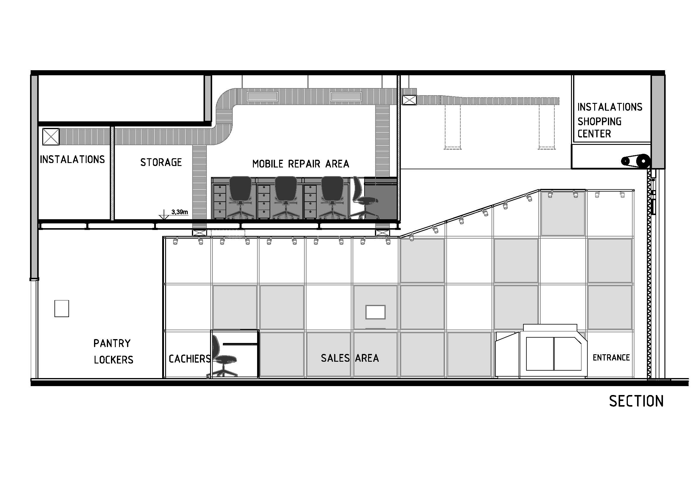
Design for mobile and tablet acessories store.
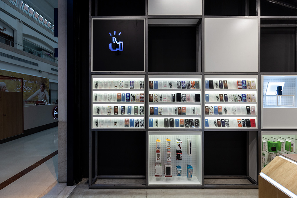
The concept was created from the dematerialization of the logo the brand: a pixelated “like” sign.
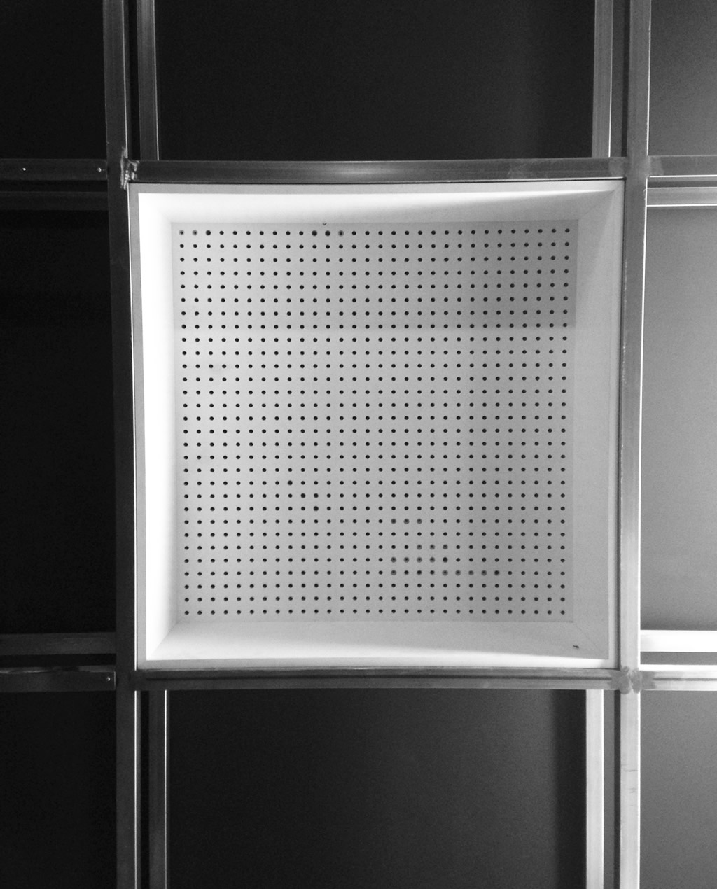
We use the pixels as reference to create a module to display products and, from that module, we create a grid that supports the various functions in the sales area.
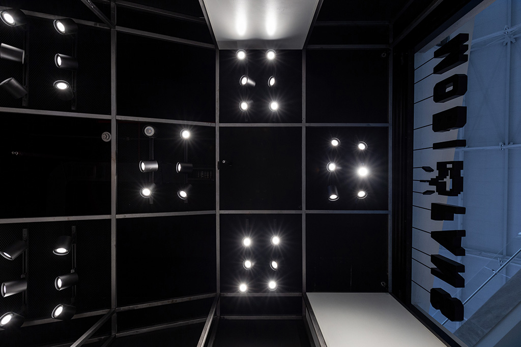
This store has a second floor where is located the technical area for mobile repairs. For this reason, the metallic grid goes lower below the second floor reinforcing the perspective perception.
Info:
Project Year: 2018
Area: 74sqm (Ground floor: 50sqm, Mezanini: 24sqm)
Location: Porto Alegre | Brazil
Architects: Sbardelotto Arquitetura – Gustavo Sbardelotto and Jessica Kichler
Initial concept: Arq. Gustavo Sbardelotto and Renata Beck
Photographs: Marcelo Donadussi

